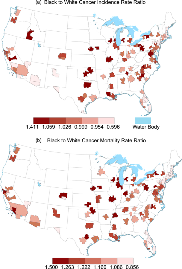
Figure 3. Geographic variation in Black-to-White cancer incidence and mortality disparities across US metropolitan areas.

Shown are the spatial distributions of Black to White disparities in cancer incidence (panel a) and mortality (panel b). Quantile breaks are used on both maps, such that one fifth of each map is in each color category, to illustrate the relationship between large cancer mortality and incidence disparities across US metropolitan areas. Of the 100 largest US metropolitan areas, information was available for all but 3 areas for mortality, and all but 5 areas for incidence.
