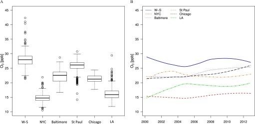
Figure 2.
Ambient ozone () exposure estimated at the participants’ residential locations. (A) Distribution of concentrations at baseline by study regions, and (B) mean estimated concentrations at all participants’ homes from 1999 to 2013. Boxes cover the 25–75th percentile (interquartile range; IQR) with a center line for the median concentration. Whiskers extend to the highest observation within 3 IQRs of the box, with more extreme observations shown as points. Note: W-S, Winston-Salem; NYC, New York; LA, Los Angeles.

