. 2019 Jul 19;127(7):077006. doi: 10.1289/EHP4731

Figure 3.

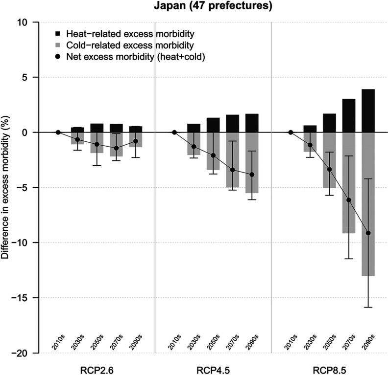
Figure 3 displays a graph titled Japan (47 prefectures), plotting difference in excess morbidity percentage (ranging from negative 20 to 10 in intervals of 5) (y-axis) across RCP2.6, RCP4.5, and RCP8.5 (with the series 2010s, 2030s, 2050s, 2070s, and 2090s each) (x-axis), representing heat-related excess morbidity, cold-related excess morbidity, and net excess morbidity (heat plus cold).

Deviations in excess morbidity in diarrhea in Japan over time. The graph indicates the change in excess morbidity by decade in comparison with 2010–2019 for three climate change scenarios (RCP2.6, RCP4.5, and RCP8.5). Estimates are presented as GCM-ensemble averages. Black vertical areas indicate 95% empirical confidence intervals (eCIs) of the net change. GCM,  general circulation model; RCP,  representative concentration pathway.