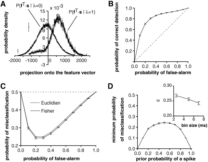
Fig. 5.
Quantification of the feature extraction performance (same example as in Fig. 4). A, Distributions P(fT·s‖λ = 0) (left curve) and P(fT·s‖λ = 1) (right curve) of the stimulus projected onto the feature vector f. The distributions were computed using 241 bins centered at the mean of each distribution and covering ±3 SD. The last bin on each side represents the tail of the distribution. Note the large tail for negative values of f. Error bars represent SD over 10 repetitions of the same experiment. B, The probability of correctly identifying a stimulus vector s as eliciting a spike plotted as a function of the probability of incorrectly classifying a stimulus vector s as eliciting a spike (= false alarm). This plot, which is called an ROC curve, corresponds to the performance of the linear classifier hf,θ (s) for different values of the threshold θ. Decreasing the threshold increases the probability of false alarm. Dashed line, Chance level.C, Probability of misclassification 1/2 PFA + 1/2(1 − PD) plotted as a function of the probability of false alarm, PFA. The minimum, minPFA[1/2PFA+ 1/2(1 − PD)] yields the value of ε used to characterize the performance of single spikes to convey information on the presence of temporal features in the stimulus. Dotted line, Performance of the Euclidian classifier (see Fig. 4H). D, Minimum probability of misclassification minPFA[(1 − p1)PFA + p1(1 − PD)] as a function of the prior probability of a spike in a bin, p1. The choice p1 = 1/2 used to compute ε (seeC) corresponds to the least favorable prior (i.e., the highest possible value for the probability of misclassification).Inset, Dependence of ε on the bin size Δt. Although ε decreases with bin size in this example, increases and minima for intermediate bin sizes were also observed.

