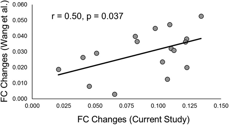
Figure 6.

Scatterplot of PPC rTMS-induced hippocampal FC [z(r)] changes across networks from Yeo et al. (2011). Each dot represents the rTMS-induced hippocampal FC change from the current study (x-axis) and Wang et al. (y-axis) within one of the 17 networks from Yeo et al. (2011). The black line represents the regression line across individual data points.
