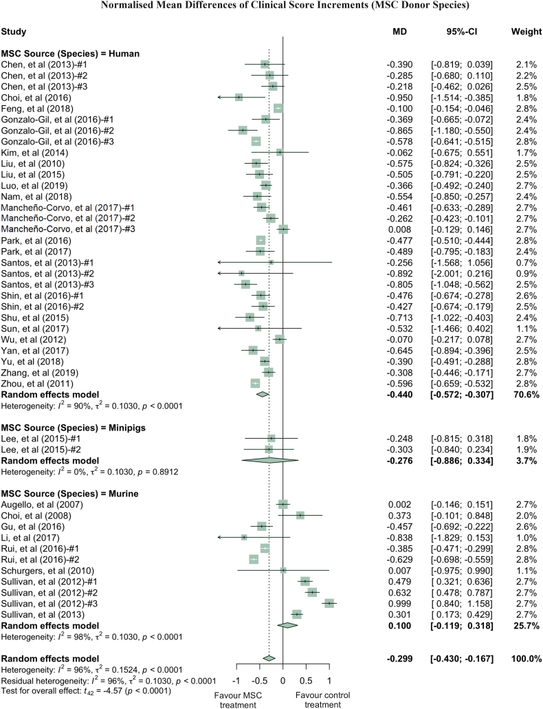
Fig. 3.
Forest plots showing normalised mean difference (MD) of clinical score changes and 95% CI for the subgroup of MSC donor species. The graph was generated using the meta package in R. All results were normalised with the sham control group as described in the methods. For all the plots, the vertical line indicates no effect, left hand side indicates favouring MSC treatment while right side indicates favouring PBS control treatment. The size of the box indicates the weighting of each study, and the thin horizontal whisker indicates the 95% CI. Random-effects model was used to summarise the effect sizes. Heterogeneity is denoted by the Ι2 and τ2.

