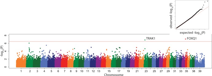
Fig 5. Manhattan plot of linear mixed model GWAS of PC6.
Marker position plotted on the X axis against –log10(P) on the Y axis. The Bonferroni adjusted genome wide p value threshold is drawn as the red line across the plot. QQ plot of expected –log10(P) for no association against observed –log10(P) is shown as insert.

