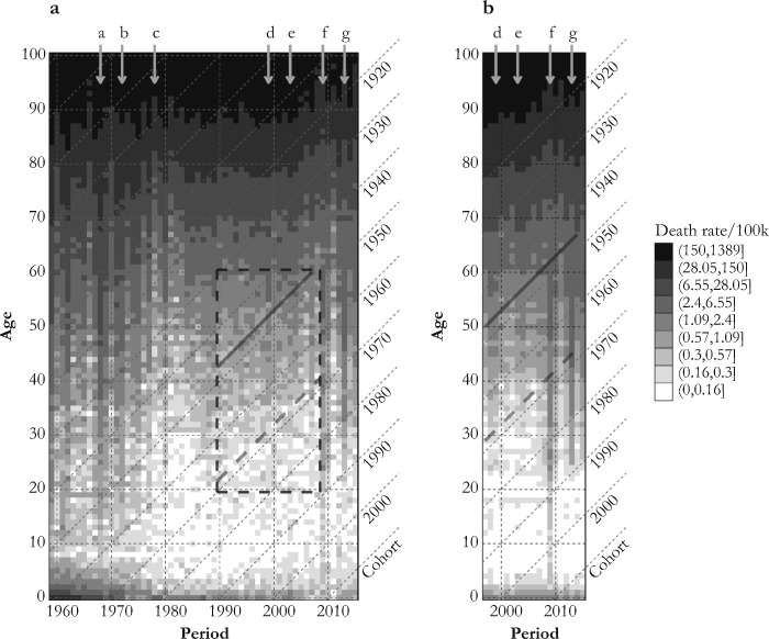
Fig. 4.
Lexis surfaces of influenza mortality rates estimated by the Serfling model, 1959–2016 (panel a) and the Surveillance-Serfling model, 1997–2016 (panel b). The vertical arrows a, b, d, and e indicate periods of severe H3N2 epidemics. Arrow c marks the reappearance of H1N1 (1977–1978); arrows f and g indicate periods dominated by pH1N1. The solid and dashed black diagonal lines mark the 1947 and 1968 birth cohorts, respectively. The surface covered by the dashed square in panel a is shown in a three-dimensional perspective in Fig. 5.

