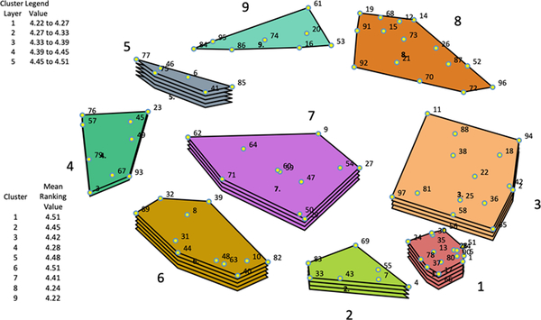
Figure 1: Concept Map.
Statements (points) situated close to each other on the map (e.g. #14 and #91) were sorted together more often by participants, indicating their similarity. Items situated further from each other on the map (e.g. #14 and #44) were sorted together less often or never, indicating their dissimilarity. Relative distance between points is meaningful, while orientation (top, bottom, center, etc.) is not. The nine clusters are identified. The mean ranking value of each cluster is depicted by the number of layers shown: a greater number of layers indicates a higher mean ranking value. Higher mean ranking values are associated with the cluster being perceived by participants as having a higher level of impact on living a good way of life. We found some statistically significant differences in rankings between clusters, though effect sizes were comparable.

