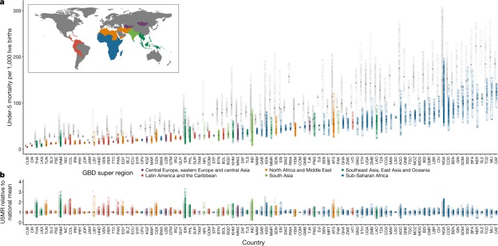
Fig. 2. Geographical inequality in U5MR across 99 countries for 2000 and 2017.
a, Absolute inequalities. Range of U5MR estimates in second administrative-level units across 99 LMICs. b, Relative inequalities. Range of ratios of U5MR estimates in second administrative-level units relative to country means. Each dot represents a second administrative-level unit. The lower bound of each bar represents the second administrative-level unit with the lowest U5MR in each country. The upper end of each bar represents the second administrative-level unit with the highest U5MR in each country. Thus, each bar represents the extent of geographical inequality in U5MRs estimated for each country. Bars indicating the range in 2017 are coloured according to their Global Burden of Disease super-region. Grey bars indicate the range in U5MR in 2000. The diamond in each bar represents the median U5MR estimated across second administrative-level units in each country and year. A coloured bar that is shorter than its grey counterpart indicates that geographical inequality has narrowed.

