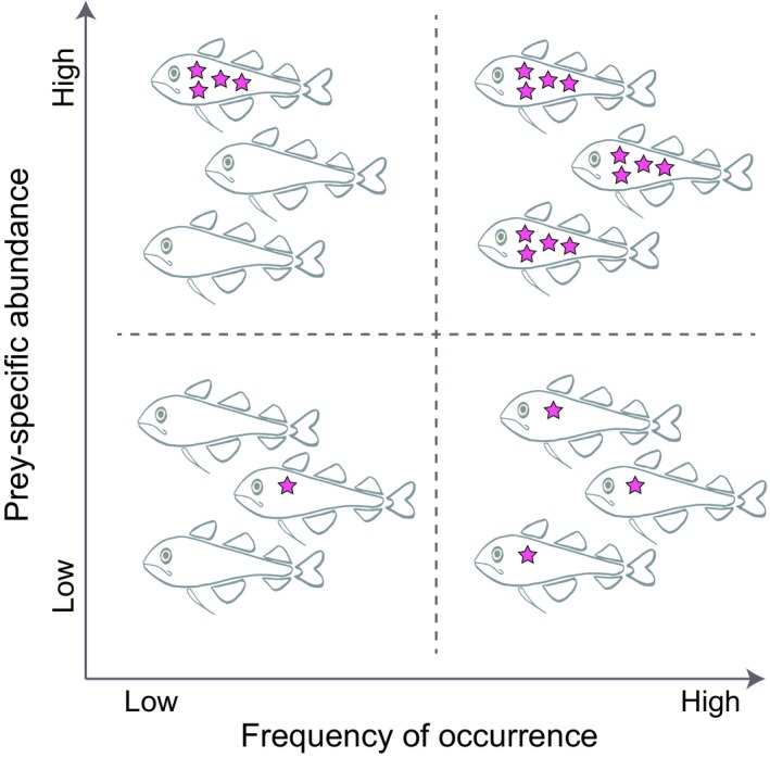
Figure 2.

Schematic illustration adapted from the feeding strategy diagram of Amundsen et al. (1996). The original diagram that operates on a continuum was here simplified into four categories representative of four extreme circumstances at each corner of the diagram. Thus, the top left corner represents a situation with 100% prey‐specific abundance (Pi) in a single fish highlighting an extremely high between‐individual component (also called between‐phenotype component by Amundsen et al. (1996)), the top right corner represents a situation with the highest FO and 100% Pi illustrating an extremely high population specialization, the bottom left corner represents a situation with low FO and low %Pi, and the bottom right corner a situation with high FO and low %Pi illustrating a high within‐individual component (also called within‐phenotype component by Amundsen et al. (1996)) and a population generalization
