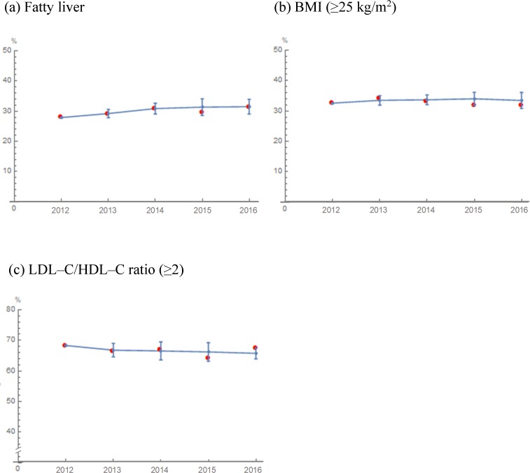
Fig 1.
Projected prevalence in cohort 1 from 2012 to 2016: (a) Fatty liver, (b) BMI (≥25kg/m2) and (c) LDL–C/HDL–C ratio (≥2). The trajectories of the projected prevalence (blue curve) are illustrated. Error bars indicate the mean prevalence within ±2 SD as Monte Carlo variations. Red dots indicate the mean prevalence in the study cohort observed in 2012‒2016.

