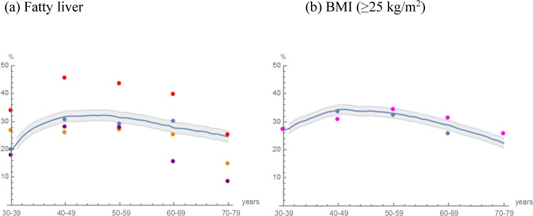
Fig 3.
Projected prevalence in cohort 2 and recorded prevalence in external cohorts: (a) Fatty liver, (b) BMI (≥25 kg/m2). The trajectories of the projected prevalence in cohort 2 (blue curve) are illustrated. Areas in gray indicate the mean prevalence within ±2 SD as Monte Carlo variations. Blue dots indicate the prevalence in the study population recorded in 2012‒2016 (n = 10179). Observed external cohort data were indicated by purple [29], orange [4], red [28] and magenta dots [35].

