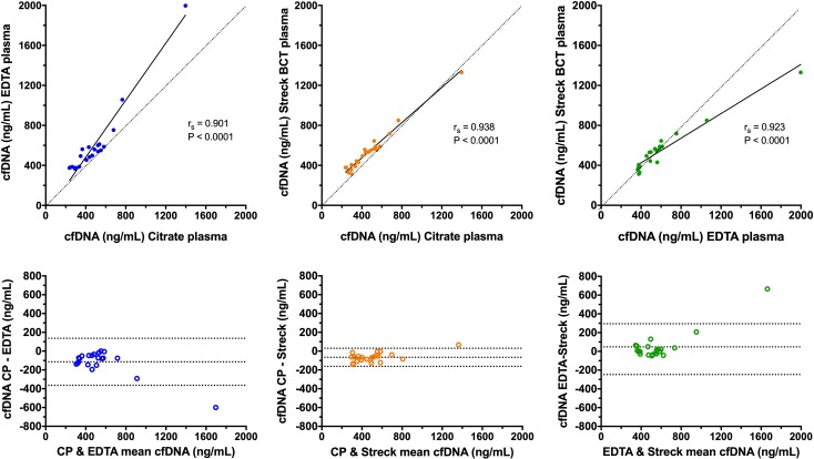
Figure 2.
Scatterplots (upper panels) and Bland-Altman plots (lower panels) comparing the cfDNA concentrations in each of the three sample types. In the scatterplots, results from pairs of sample types have been plotted against each other combined with associated values for Spearman’s correlation coefficient (rs) and the relevant significance value. The solid black line represents the line of best fit by Deming regression. Note the rs value does not correspond to the Deming regression line. The dotted lines are lines of identity, included for reference. In the Bland-Altman plots, the mean value of the two measurements from the two sample types is plotted on the abscissa (x-axis), while the difference between the two sample types is plotted on the ordinate (y-axis). The middle of the three horizontal dotted lines represents the mean difference between the two sets of values, whereas the upper and lower dotted lines represent ±1.96 SD of the mean difference. cfDNA, cell-free DNA.

