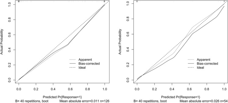
Figure 6.
Calibration curve of radiomics nomogram. Left: calibration curve of the training cohort; Right: calibration curve of the validation cohort. The y-axis shows the actual result. The x-axis represents the predicted probability of PQ. The diagonal dotted line represents an ideal model. The solid line indicates the performance of the nomogram. If the solid line is closer to the diagonal dotted line, it means a better prediction.

