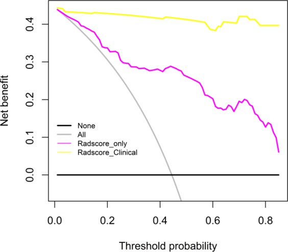
Figure 8.

Decision curves for radiomics nomogram. The y-axis represents the net benefit (The net benefit was calculated by subtracting the proportion of all false-positive patients from the true-positive patient, and the weight is the relative hazard of abandoning treatment versus negative patients). The red dotted line indicates the radiomics nomogram. The black dotted line indicates the radiomics features. The grey solid line indicates the hypothesis that all patients were treated by one scheme (for example, assuming that all patients were with PQ poisoning). The black line represents the hypothesis that all patients were treated by another scheme (For example, assuming that all patients were with pneumonia). Obviously, the radiomics nomogram was better than Rad-score with added net benefit.
