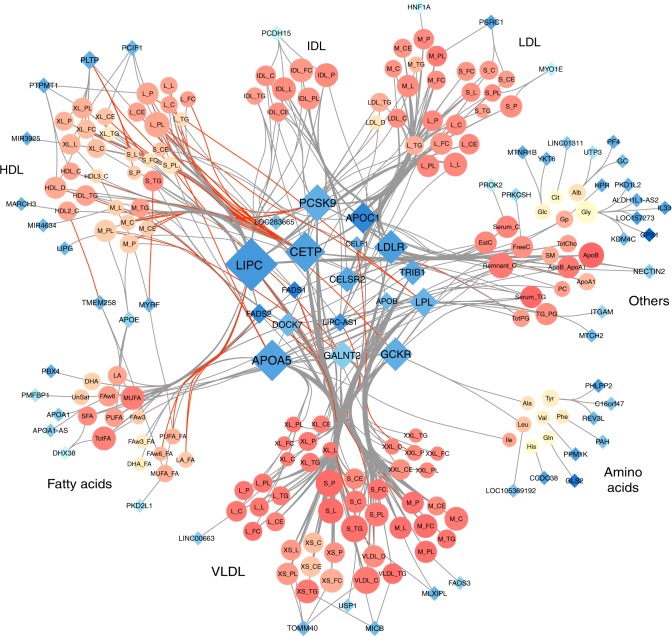
Fig. 3.
Network representation of the 588 region-metabolite associations identified in the 158 metabolites GWAS in METSIM. For each region we used the nearest gene of the most associated variant. Each node represents either a gene (blue diamonds, N = 70) or a metabolite (orange circles, N = 147). Each edge is an association between one gene and one metabolite. Node size is directly proportional to the number of other nodes associated with it. Red edges correspond to opposite effect of a gene on a metabolite, compared with the other metabolites associated with the same gene. Metabolites colors (orange shades) represents correlation strength between a given metabolite and all other metabolites. Genes colors (blue shades) represent strength of correlation between a given gene and associated metabolites, quantified as the average of r2 across all corresponding metabolites

