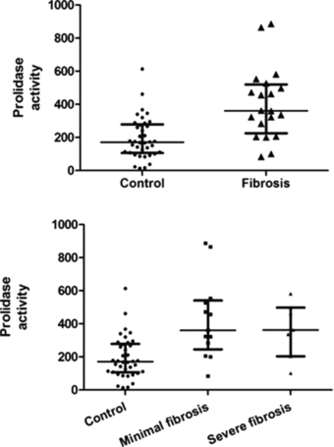
Figure 3.

(A) Scatter plots for serum prolidase enzyme activity (SPA) in the control group versus the patients undergoing liver biopsy. The horizontal lines represent the median and the interquartile range. (B) Scatter plots for serum prolidase enzyme activity (SPA) stratified on the basis of increasing degree of fibrosis. The horizontal lines represent the median and the interquartile range.
