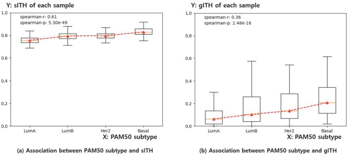
Fig 10. Boxplot for representing the association of sITH and gITH with PAM50 subtype of each breast cancer sample.
a) X-axis indicates the PAM50 subtype of each sample, ordered by known malignancy of each subtype. Y-axis indicates the sITH value of each sample. b) Same as a), except that the Y-axis indicates the gITH value of each sample at this time. The result indicates both sITH and gITH have a significant correlation with PAM50 subtype, while sITH shows better association than gITH. Note that sITH and gITH values are standardized by dividing maximum values among samples for easy understanding of the data distribution.

