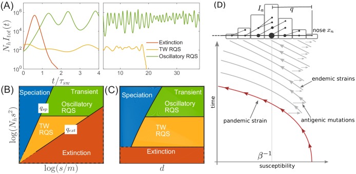
Figure 3. Extinction, speciation, and oscillations in multi-strain SIR models.
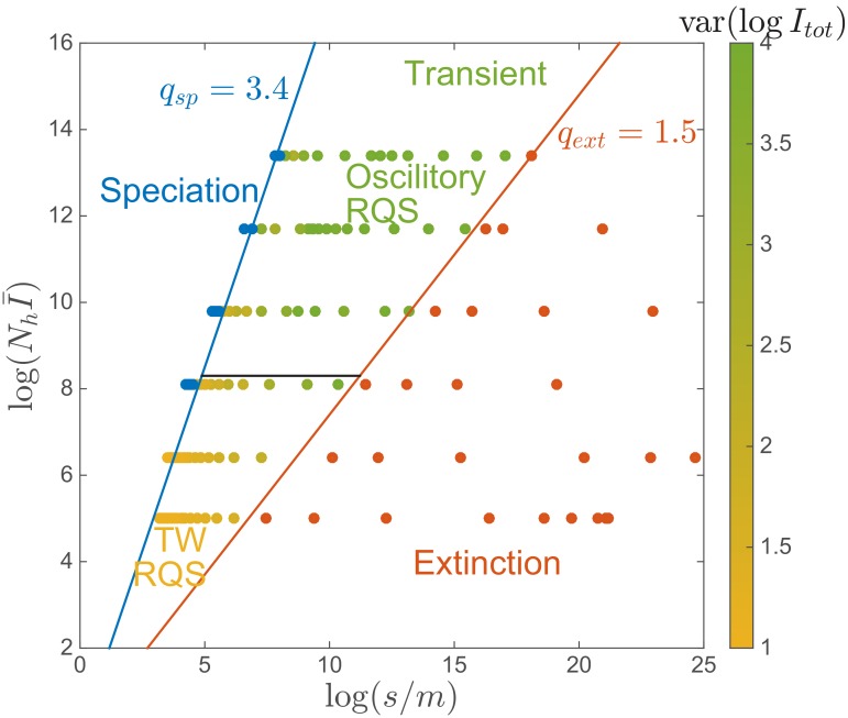
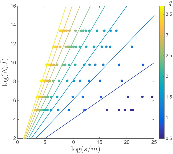
(A) Typical trajectories of infection prevalence in the parameter regimes corresponding to extinction (red), traveling wave RQS (yellow) and oscillatory RQS (green). Panels B and C schematically show parameter regimes corresponding to these qualitatively different behaviors. As explained in the text the boundaries of the RQS regime depend explicitly on the time scale considered (see also Figure 7). Simulation results supporting this diagram are shown in Figure 3—figure supplements 1 and 2. Panel (D) is a schematic illustrating how a novel pandemic strain (red) can settle into an endemic RQS state. As the cumulative number of infected individuals increases, the susceptible fraction decreases, and survival of the strain depends on the emergence of antigenic escape mutations (gray). The top part of the panel illustrates the population composition at a particular time point. Rare pioneering variants are mutations ahead of the dominant variant and grow with rate . (Note, that boundaries of the ‘extinction’ regime in (B,C) correspond to value close to one.) Different lineages are related via their phylogenetic tree embedded in the fitness distribution in the population.


