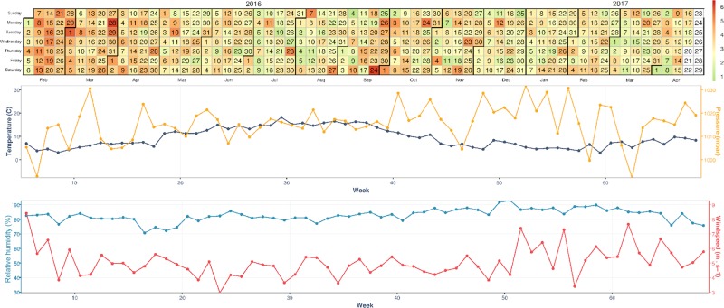
Fig. 4.
The proportion of eligible active participants reporting a pain event during the study period, aligned with average UK weather data from February 2016 to April 2017. Heat map colors indicate the percentage of participants reporting a pain event on that day, ranging from 1–6% participants. The denominator per day is the number of participants who reported their pain on the day of interest and the prior day, irrespective of the level of pain on the prior day and thus their eligibility for a pain event

