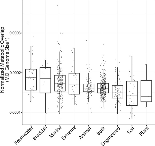
Figure 3.

Metabolic overlap across all ecosystems. Boxplots are plotted with the black bar representing the median, the box corresponds to the 25% and 75% quartiles, and the whiskers are the extreme values. The y axis is MO normalized by genome size to account for differences between median genome sizes across ecosystems. The ecosystems are sorted from left to right based on the median MO. Each point represents the median MO of all MAGs from a given study.
