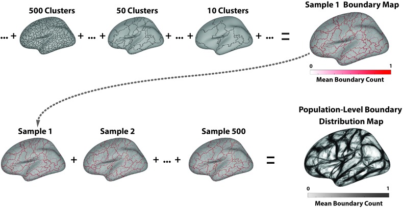
Figure 1.
(Top) Illustration of the process for deriving a sample boundary distribution map. Only the left hemisphere is shown for simplicity. The boundary map from each step of the hierarchical clustering process is summed and divided by the total number of clustering steps (the number of initial vertices), resulting in a mean sample-level boundary map (upper right plot). Higher values in this map (darker lines) denote vertices that were marked as boundaries earlier in the clustering process; that is, they divide more functionally distinct regions than lighter lines. (Bottom) Illustration of the process for building the population-level distribution. The sample boundary maps are summed and divided by the total number of samples (500), resulting in the population-level boundary distribution map (lower right plot). Higher values in this map (darker lines) denote vertices that more reliably divide functionally distinct regions across the samples.

