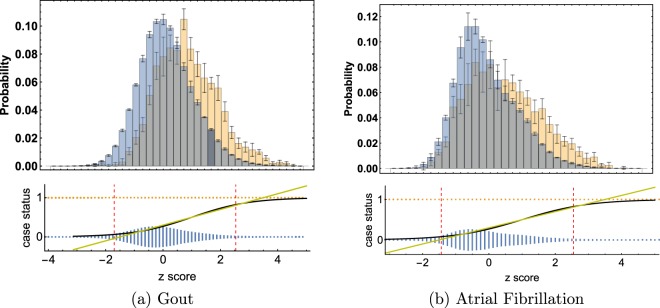
Figure 1.
Top plots are histograms of controls (blue) and cases (gold). The bar heights are the averages over 5 AA testing runs. The error bars are standard deviations. On the bottom the same average case and control points are plotted on separate lines (1/0) for cases and controls. The height of the bars (gold and blue) represents the relative density of data points in that bin. Note that on the bottom, the gold and blue bars have been normalized using the same scale; the gold density looks small because most of the individuals in the data set are controls. The red dashed lines mark the 4% and 96% quartile of data, i.e. 92% of the data lies between those points. The x-axes are the same for top and bottom graphs: z scores, or number of standard deviations from the control mean. A linear (yellow) and logistic (black) curve are plotted over this range. It is clear that the difference between linear and logistic curves is negligible in the region where the data is concentrated.

