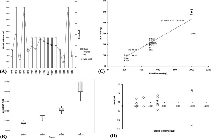
Figure 3.

(A) Bar graph to compare the yield of DNA and the amount of blood volume required in our study protocols with other published protocols and kits. R1‐5(Reference Protocols), KT1‐5 (Reference kits), ST1‐2(Standard Protocol) F or S (fresh or frozen). The results of the experimental protocol are mentioned “Fresh” or “Frozen” in bold. (B) Box plot to compare the average yield of DNA from different blood volumes as reported in our study and other published reports. (C) Scatterplot to compare DNA yield from our protocol with that of published reports. R1‐5 (Reference Protocols), KT1‐5 (Reference kits), ST1‐2(Standard Protocol) F or S (fresh or frozen). The results of the experimental protocol are mentioned “Fresh” or “Frozen” in bold. (D) Residual Plot to show whether the linear regression model is appropriate for the dataset Residual values for DNA from fresh and frozen blood samples following our protocol are symbolized as (●) and (♦) respectively
