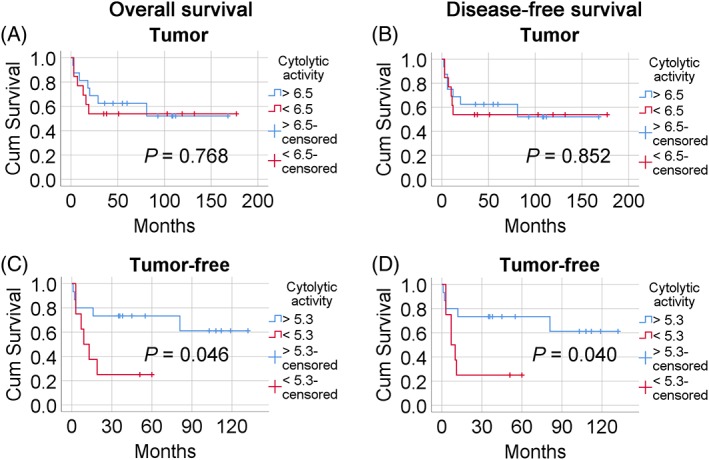
Figure 2.

The influence of cytolytic activity in tumor and tumor‐free samples on patient survival. Kaplan–Meier curves of overall (A,C) and disease‐free (B,D) survival are shown. Blue lines represent patients with high cytolytic activity and red lines patients with low cytolytic activity. (A,B) Tumor samples (C,D) Tumor‐free samples.
