. 2019 Sep 12;16:E125. doi: 10.5888/pcd16.190053

Figure 1.

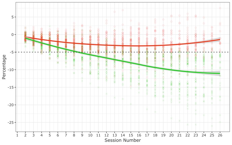
This graph plots values along a y-axis (percentage weight change) and an x-axis (number of sessions, from 1 through 26). For each session and each participant in the program, the graph indicates a percentage change in weight. It shows that participants who met the target weight-loss goal crossed the 5% weight-loss threshold at approximately session 9. It also shows that among those who did not achieve the 5% weight-loss goal, participants lost a percentage of body weight slowly but steadily until about session 16, at which point the they began to gain a percentage of body weight slowly and steadily until session 26. Among those who achieved 5% weight loss, the percentage of body weight declined at a faster rate than the rate among those who did not achieve goal, and it continued to decline steadily until session 26.

Percentage change in weight among 165 participants in the Vanderbilt University Medical Center (VUMC) Faculty and Staff Health and Wellness Diabetes Prevention Program, 2014–2017. The dotted line represents the 5% weight-loss goal. Each green cross represents a participant who achieved the 5% weight-loss goal. Each red circle represents a participant who did not achieve the 5% weight-loss goal. The solid red line and the solid green line are LOWESS (locally weighted scatterplot smoothing) nonparametric regression trend lines; shading indicates 95% confidence intervals.