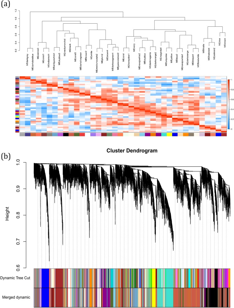
Fig. 4.
(a) Heatmap plot of the identified modules. Each row and column is in accordance with one module, in which red and blue shows the positive correlation and negative correlations, respectively. (b) Dendrogram of genes clustered based on a dissimilarity measure (1-TOM) with assigned module colors. The colored rows show the module membership obtained by the dynamic tree cut method and after merging modules

