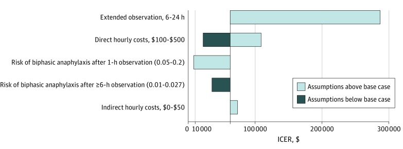
Figure 2. Tornado Diagram of Deterministic Sensitivity Analyses.
Incremental cost-effectiveness ratio (ICER) is shown in 2019 US dollars (cost per biphasic anaphylaxis episode observed). Tornado diagram shows deterministic sensitivity analyses, with light blue bars representing assumptions above and dark blue bars representing assumptions below the base case analysis.

