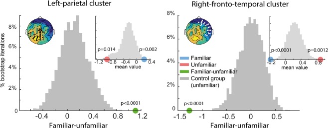
Figure 3.
Bootstrap analysis comparing mean differences between “familiar” and “unfamiliar” responses from the main group to baseline difference distributions sampled from the control group (grey). As expected, difference distributions in the control group are centered around 0. Left upper insets show the respective electrode cluster overlaid on the ‘familiar – unfamiliar’ difference of the main group. In both clusters, responses observed in the main group (green dots) are well outside the baseline distributions (p < 0.001). Right upper inset figures show mean responses to “familiar” (blue dot) and “unfamiliar” (red dot) conditions from the main group, overlaid on distribution of responses from the control group (grey bars; collapsed across “familiar” and “unfamiliar”). Main group responses to both “familiar” and “unfamiliar” conditions are found on opposite sides of the control distributions, revealing a repulsive effect.

