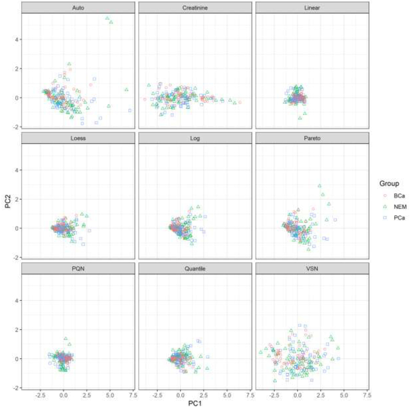
Figure 2.

Plot of the first two principal component scores for each normalized data set. The horizontal axis represents scores for the first principal component and the vertical axis has the corresponding scores for the second principal component. Each pane displays the principal component scores for a different normalization method. Patients with bladder cancer are represented by red circles, patients with prostate cancer are represented with blue squares, and patients showing no evidence of malignancy are shown with green triangles.
