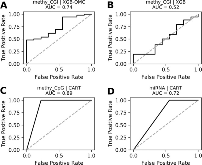
Figure 4.
ROC curves of the most predictive case of best models. ROC curves obtained plotting the true positive rates against the false positive rates calculated from the models presented in Figures S4. The AUCs were calculated from the predictions that came out from the nested and standard LOOCV runs and were respectively carried out for OMC and CART models. We notice that AUCs follow the same trend as MCCs and that models shown in (A), (C), and (D) are very robust. The dashed line delimitates the expected AUC from random classification.

