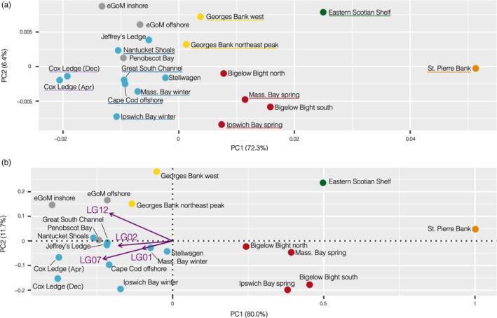
Figure 2.

(a) MDS plot showing the population structure based on the pairwise FST matrix calculated with the full SNP data set. (b) PCA biplot showing the population structure based solely on haplotype frequencies at the four chromosomal inversions, with the contributions of each of the inversions shown by the purple arrows. The colors represent our a priori understanding and expectations of the population structure: red and blue = northern spring coastal complex and southern complex, respectively, of Kovach et al. (2010); yellow = Georges Bank; green = eastern Scotian Shelf; orange = St. Pierre Bank; gray = eastern GoM. Locations that were grouped for estimating pairwise FST among groups are underlined in the same colors
