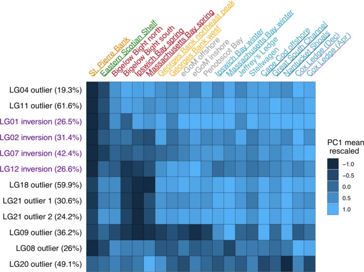
Figure 5.

Heat map depicting how the chromosomal inversions and outlier regions of the genome differentiate among the 20 sampling locations included in the study. The labels of the sampling location are colored according to our expectations of the population structure: red and blue = northern spring coastal complex and southern complex, respectively, of Kovach et al. (2010); yellow = Georges Bank; green = eastern Scotian Shelf; orange = St. Pierre Bank; gray = eastern GoM. The color of the underlined labels indicates the sampling locations that were grouped for our pairwise Manhattan plots in Figure 3. Values in parentheses on the y‐axis are the amount of variation explained by PC1 in each individual‐level PCA
