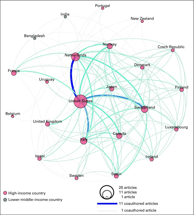
FIG 3.
Each circle in the network graphic represents a country represented among the coauthors of the 20 International Cancer Screening Network publications. The size of a circle is proportional to the number of publications in which the country is represented. The color of a circle represents the country’s income level (World Bank Atlas method of classification). The lines connecting the circles represent coauthorships, with a gray line representing one coauthorship and a dark blue line representing 11 coauthorships, which was the maximum number found. The color gradient between gray and dark blue represents the range from one to 11 coauthorships.

