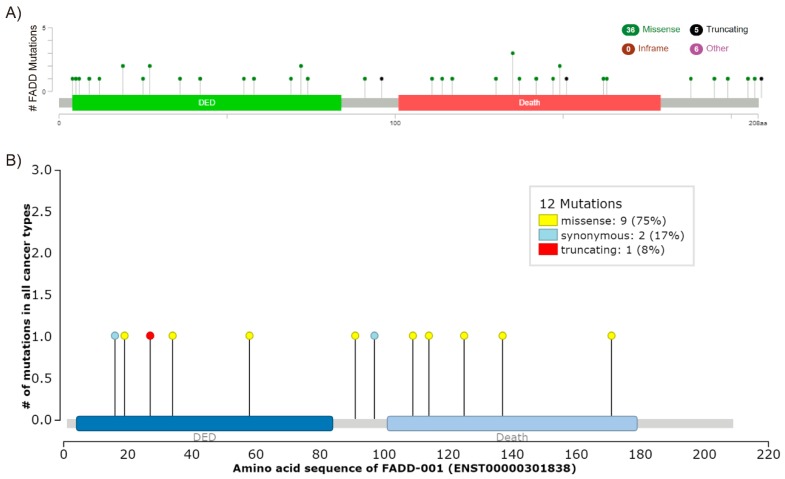
Figure 4.
FADD mutations. (A) Screenshot modified from cBioPortal. Mutation diagram circles are colored with respect to the corresponding mutation types. In case of different mutation types at a single position, the color of the circle is determined with respect to the most frequent mutation type. (B) Screenshot image modified from IntOGen. The mutations needle plot shows the distribution of the observed cancer mutations along the protein sequence and its possible mutational clusters and hotspots. The needles’ height and head size represent mutational recurrence. Needles of different categories that fall in the same amino acid residues are stacked.

