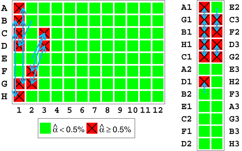
Figure 13:
Left: Eight contaminated samples as they appeared on part of the sample preparation plate. The letters to the left of the plate indicate the rows and numbers below indicate columns. Arrows indicate our method’s estimates for which sample contributed DNA to each contaminated sample. Right: The position of the same samples on the genotyping array. Letters and numbers indicate the row and column of the plate from which the samples were transferred. Arrows have the same interpretation.
This figure shows that the contaminated samples are adjacent to their contaminating sample on the array, while far apart and without a clear pattern on the processing plate. The relative ease of explaining the pattern of adjacent mixing on the array compared to the processing plate suggests that the DNA mixture occurred on the array itself.

