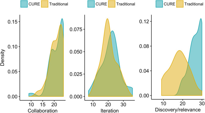
FIGURE 4.
Density plots for each course design feature: collaboration, iteration, and discovery/relevance. The degree of curve overlap, illustrated by the green color of overlapping blue and yellow, indicates how similar the course types were for each element. Broad curves illustrate high variability among student responses, while narrow peaks indicate lower variability.

