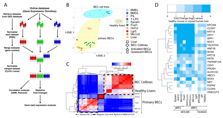
Figure 1.
Workflow and clustering of BEC transcriptome data sets. (A) Schematic overview of the workflow to merge microarray data from different platforms. Colored bars represent boxplots of the expression of all genes from one sample. Three colors are an example of three different datasets with multiple samples. (B,C) T-distributed stochastic neighbor embedding (t-SNE) and Pearson correlation analysis of mouse transcriptomic data from BEC cell lines, primary BECs and healthy livers. (D) Relative gene expression analysis (fold change, log2) of common BEC markers in primary human and mouse BECs compared to livers.

