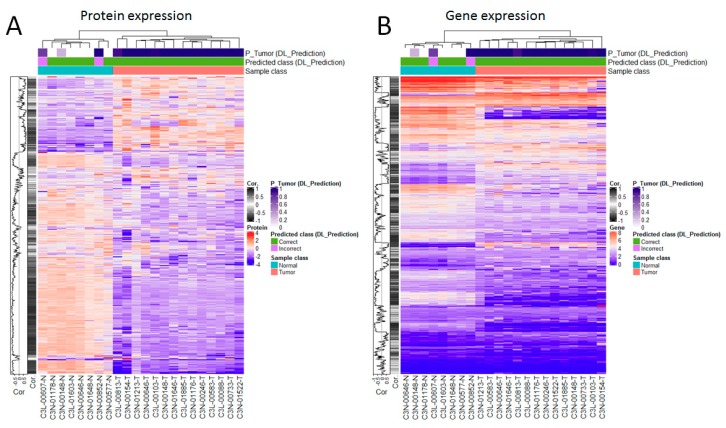
Figure 4.
Analysis of the correlations between the proteomics data and their encoding genes, and between each dataset and the histology-based predictions. (A) Focus on the proteomics data. (B) Focus on the gene expression data. In each plot, the rows show proteins (A) and their corresponding coding genes (B) in alignment to facilitate comparative visualization, i.e., each row in each heatmap refers to a protein and its coding gene. Analysis performed on 22 samples with matched proteomics, gene expression and imaging data available.

