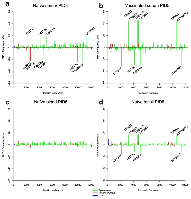
Figure 5.
Relative SNP frequency distributions in the challenge virus depicted as the mean frequency change of SNPs for the vaccinated and naïve groups compared to the inoculum as Δ%. SNPs with large changes in frequency are labelled on the plots. Samples were: (a) Serum (PID3) from naïve pigs. (b) Serum (PID5) from vaccinated pigs. (c) Blood (PID6) from naïve pigs. (d) Tonsils (PID6) from naïve pigs. The red, green, and blue colours of the bars represent non-synonymous, synonymous, and untranslated region (UTR) mutations, respectively.

