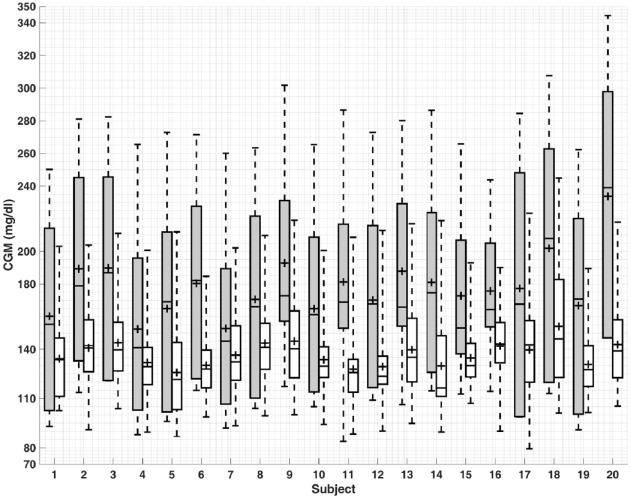
Figure 1.
Comparison of model predictive control results for the first (gray) and last (white) days of simulation for all 20 subjects. The bottom and top of the boxes are the first and third quartiles and the line inside the box is the median. The whisker’s ends represent the minimum and maximum values and + indicates mean values.

