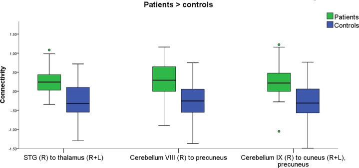
Fig. 1. Increased connectivity in patients compared with controls.
The boxplot shows the clusters were increased connectivity was found in patients (green) compared with controls (blue), in response to food with high vs. low caloric content. Circles represent cases lying between 1.5 and 3 times the interquartile range (mild outlier). The results were verified in SPSS by removing the outliers (see methods). Connectivity values were extracted with SPM. L left, R right, STG superior temporal gyrus

