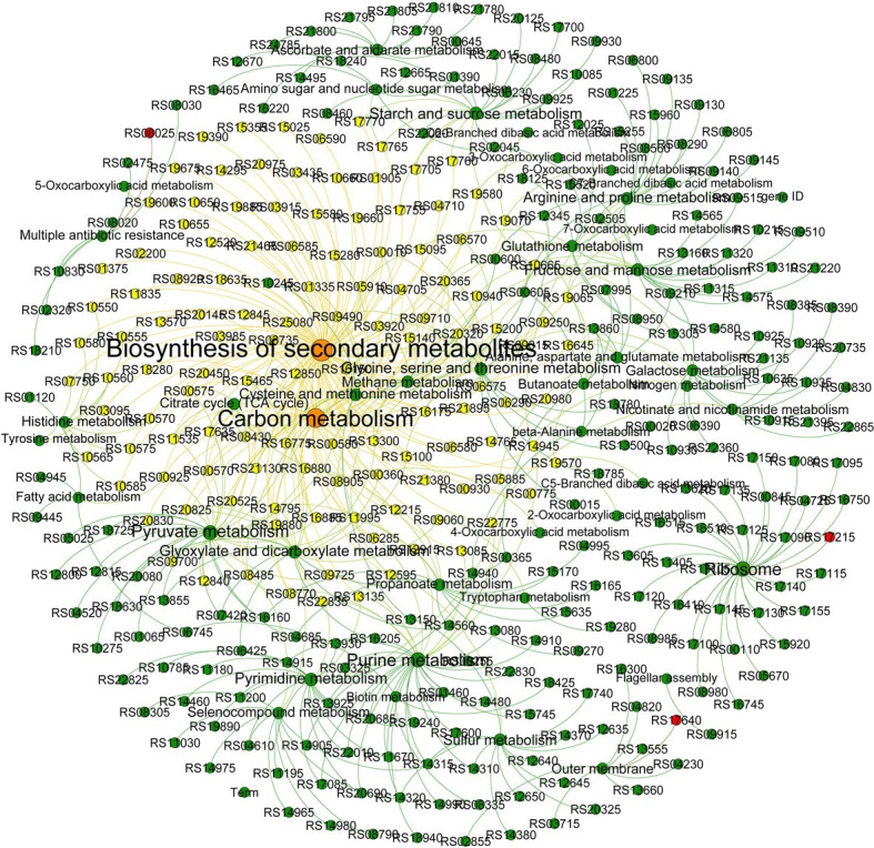
Figure 3.

Network analysis revealing the co-occurrence patterns in the pathways. The node size represents the number of genes assessed, and the larger the node, the greater the number of genes. The red nodes indicate the mutant genes. The directional lines indicate the pathway in which the genes are involved. The genes associated with the carbon metabolism and biosynthesis of secondary metabolites are connected by the yellow directional lines.
