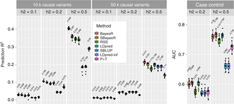
Fig. 1.
Prediction accuracy performance for the UKB genome-wide simulation. Each panel displays boxplot summaries of the prediction R2 (y-axis) or area under receiver-operating characteristic curve (AUC), in the 10,000 individual validation data set for each method (x-axis) across the 10 replicates. The simulation study contained eight scenarios that varied in the number of causal variants, 10,000 (10k) and 50,000 (10,000), and the true simulated heritability . The two genetic architecture scenarios generated were 10,000 causal variants sampled under the SBayesR model, that is, 2500, 5000 and 2500 variants from each of N(0, 0.01), N(0, 0.1) and N(0, 1) distributions, respectively, and 50,000 causal variants sampled from a standard normal distribution. Case–control phenotypes were generated from the liability threshold model with a simulated disease prevalence of 0.05 and the 10,000 causal variant genetic architecture. In each panel, LDpred has two boxplot summaries, one that has been optimised for the polygenicity parameter and the other is LDpred-inf, which is displayed for comparison with SBLUP. LDpred and SBLUP were initialised with the true heritability parameter. The mean prediction accuracy across the 10 replicates is displayed above the boxplot for each method. The centre line inside the box is the median, the bottom and top of the box are the first and third quartiles, respectively (Q1 and Q3), and the lower and upper whiskers are Q1 – 1.5 IQR and Q3 + 1.5 IQR, respectively, where IQR = Q3 – Q1. The points depict the prediction accuracy for each replicate

