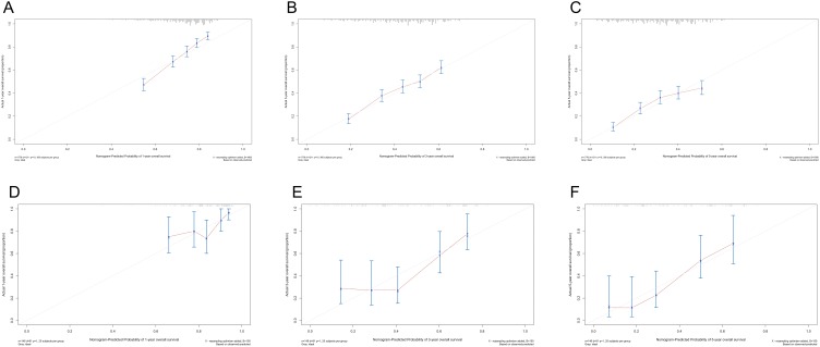
Figure 5.
Calibration curves for 1-, 3-, 5-year survival probabilities in the training cohort (A, B, C) and in the external validation cohort (D, E, F). Nomogram-predicted survival is plotted on the x axis and observed survival on the y axis. The vertical bars at the top represent the frequency of the predicted probability of survival. A plot along the 45-degree gray line indicates a perfect calibration model where the predicted probabilities are identical to the actual proportions.

