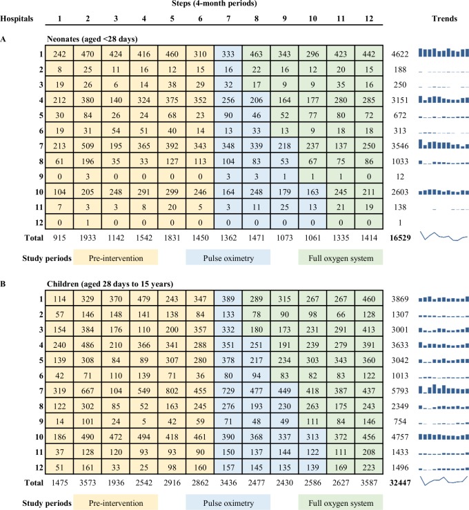
Fig 1. Study diagram showing number of admissions in each hospital, by step.
Rows indicate individual hospitals (clusters). Columns indicate individual time periods (steps). Numbers indicate the number of neonatal (A) and child (B) participants included in analyses (excluding those admitted during the 2-week transition period at the beginning of each step). We provided all hospitals with pulse oximeters and training in November 2015 (step 7) and then introduced a multifaceted improved oxygen system to three hospitals every 4 months (randomised order). Blue bar graphs show the hospital-specific admission trends over time for quick reference, with the overall trend for neonates and children indicated with a spark-line. Notes: Data from November/December 2013 not available (first half of step 1).

