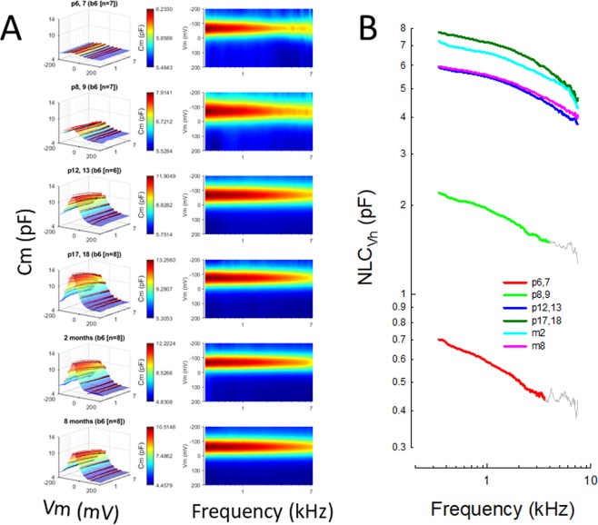
Figure 3.
(A) Left panels show full NLC spectrum (0.39–7 kHz) surface plots as a function of postnatal age, illustrating the bell-shaped NLC and its roll-off with increasing frequency. Black dots indicate means and pink dots are +se, which sit atop the Boltzmann fits. The panels on the right show the same data top-down, and provide a clearer view of the frequency response changes during aging. (B) NLCVh for each age group is log-log plotted to more clearly show the low-pass behavior that changes during aging. The colored points were used for fitting in Fig. 5. For the 2 youngest groups grey lines show regions omitted from fits because of noise at high frequencies.

