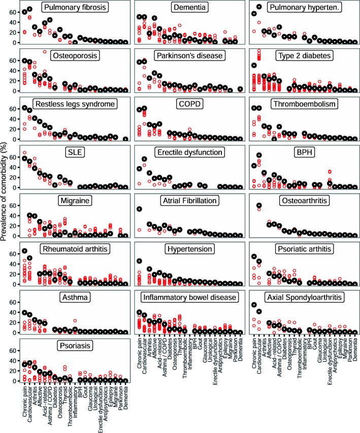
Fig. 2.
Scatterplot of the prevalence for each comorbidity for each index condition, for the community-based sample and for clinical trial participants. Black circles indicate the community-based cohort and red circles trials. The x-axis is sorted according to the prevalence of the comorbidities in the community-based sample. The sort order was obtained by ranking the comorbidities from commonest to least common for each index condition, then by taking the median across all index conditions. The individual panels are sorted by the mean comorbidity count for each index condition, from highest to lowest. Where the index condition was judged to be the same as the comorbid condition, the comorbidity was not defined, which accounts for apparently missing points on the graph. So, for example, for people in the community sample who had migraine, the most common comorbidity was chronic pain with the next most common being cardiovascular disease

