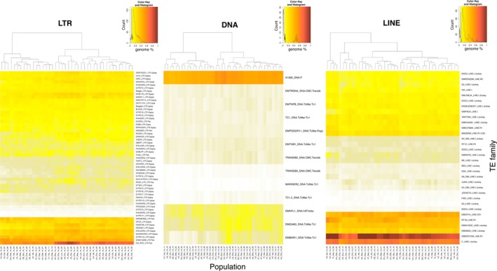
Figure 2.

Heatmap representing the genome percentage estimate of each TE family per sample. Abundance was estimated by mapping 0.5X of unassembled reads of each sample against the D. melanogaster TE library with RepeatMasker. The colour scale, from yellow to red, is proportional to the TE family abundance. Cladograms indicate the level of similarity between populations based on their relative TE abundance per family [Colour figure can be viewed at http://wileyonlinelibrary.com]
